Casa Cactus
Buenavista
How the place looks, sounds and feels — so everything we make stays unmistakably ours.
The essence
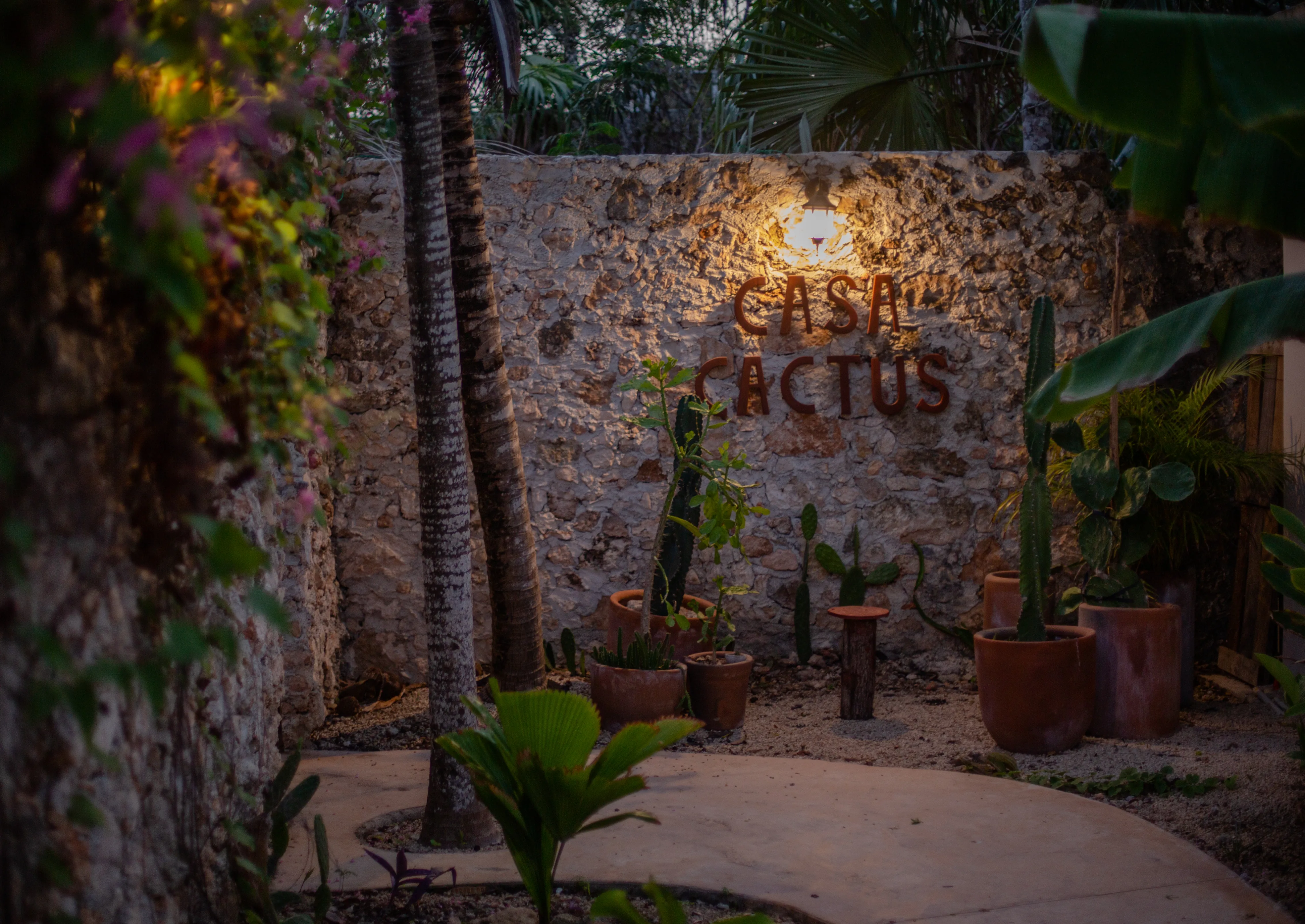
Casa Cactus is a small, peaceful guesthouse seven minutes from Laguna de Bacalar — four stone bungalows, three apartments, a freeform pool, and gardens that do most of the talking. It was never meant to be a perfect hotel. It's a place with stories, people, and the quiet beauty of a village by the lagoon.
Calm, not luxury
Stillness over polish. Space to breathe rather than amenities to count.
Honest & warm
Real people, real imperfections, a little dry humour. We don't oversell.
Rooted in place
Stone, cactus, lagoon light. The village and its rhythm are the brand.
Voice & tone
Warm, understated, sensory, and quietly funny. We write the way a thoughtful host speaks — never a brochure. Short, plain sentences. No hype words, no exclamation marks, no stock-photo enthusiasm.
- Lead with the senses — light, water, shade, stone.
- Be honest about what it is (and isn't).
- Let dry humour do the charming.
- Leave space; trust the reader.
- No "luxurious", "stunning", "paradise", "oasis".
- No exclamation marks or ALL-CAPS excitement.
- No promises we can't keep with a straight face.
- No filler adjectives stacked three deep.
Wordmark & mark
The wordmark is simply the name set in Cormorant Garamond — light weight, generous spacing. On the property it appears as rust-coloured lettering on raw stone; in digital, "Cactus" may take the terracotta accent. Keep clear space of at least one cap-height on every side. The cactus 🌵 serves as the favicon and a playful shorthand, never as a substitute for the wordmark in headers.
Colour
Cream paper and near-black ink carry almost everything. Terracotta is the warm signature; gold is the single action colour — reserved for things you can tap. Lagoon and sage appear sparingly, drawn straight from the water and the gardens. Tap any swatch to copy its hex.
Typography
UI elements
One primary action per view, in terracotta. Everything else is a quiet outline. Buttons and tags are fully rounded pills; corners on cards and images stay soft (3–4px). Motion is slow and eased — nothing snaps.
Primary = terracotta fill, darkens to ink on hover. Secondary = hairline outline, terracotta on hover. Both lift 3px.
100px3–4pxcubic-bezier(.25,.46,.45,.94)translateY(-3px).18–.28em~5rem verticalPhotography
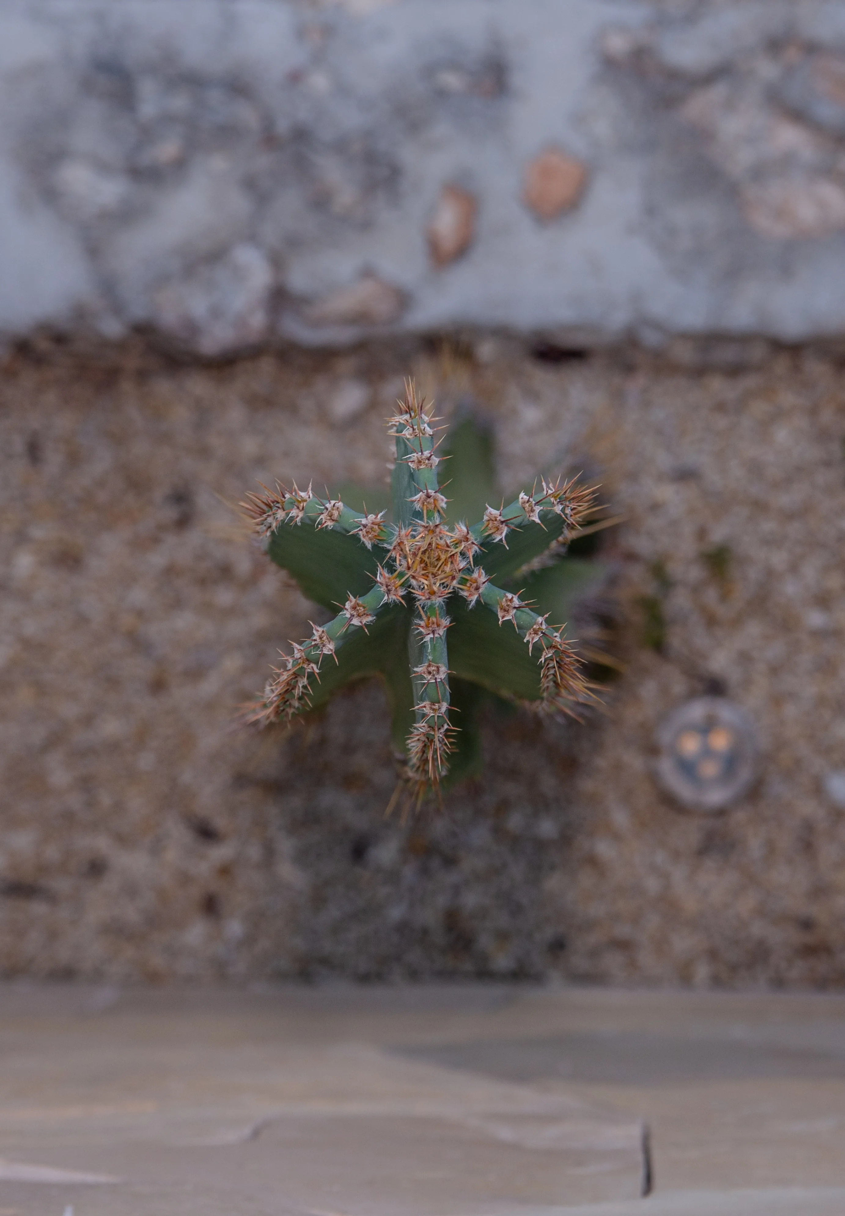
Natural light, real moments, room to breathe. Golden hour and dusk over midday glare. Let negative space and the gardens frame the subject. Avoid heavy filters, crushed saturation, and staged perfection.
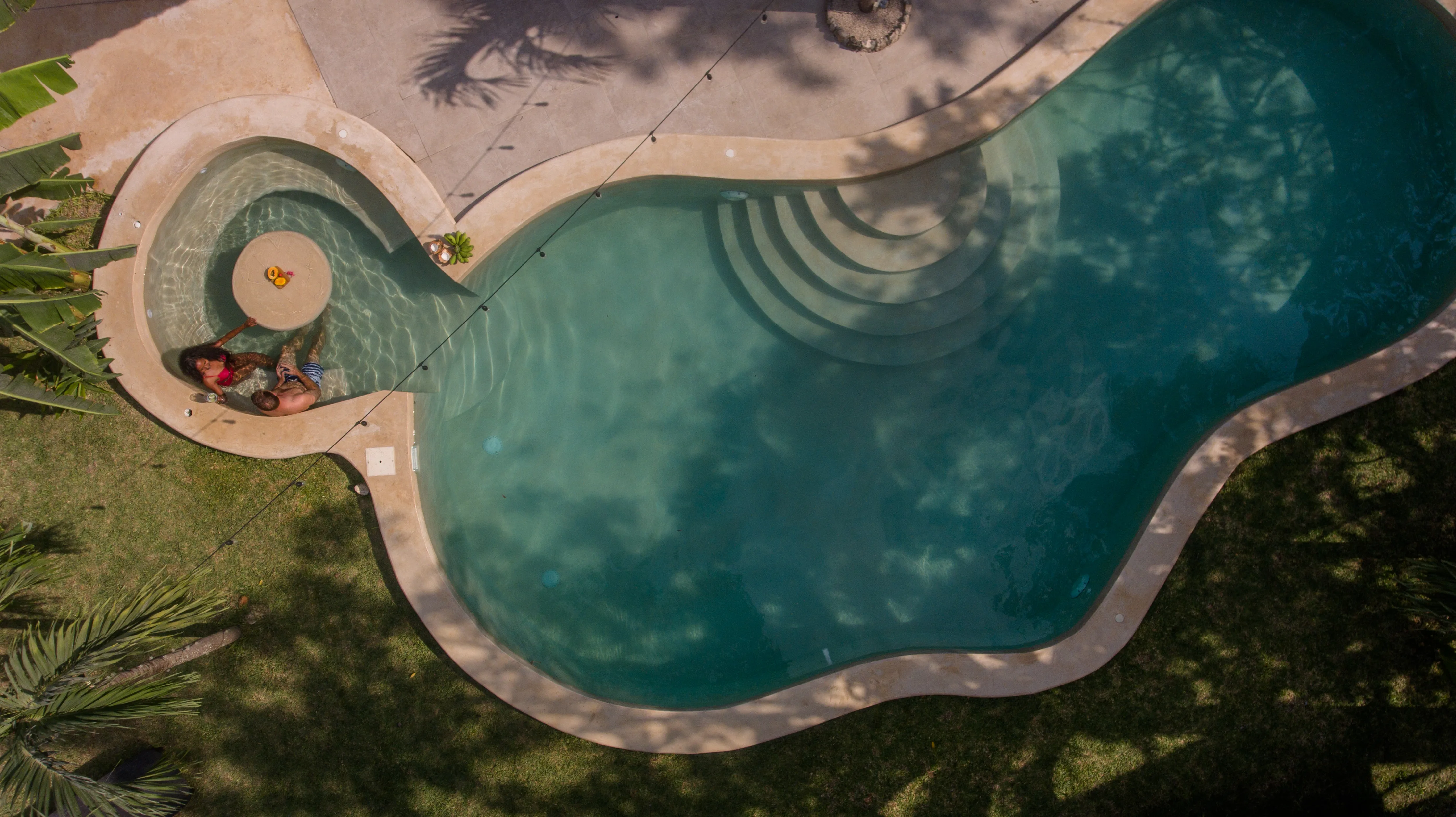
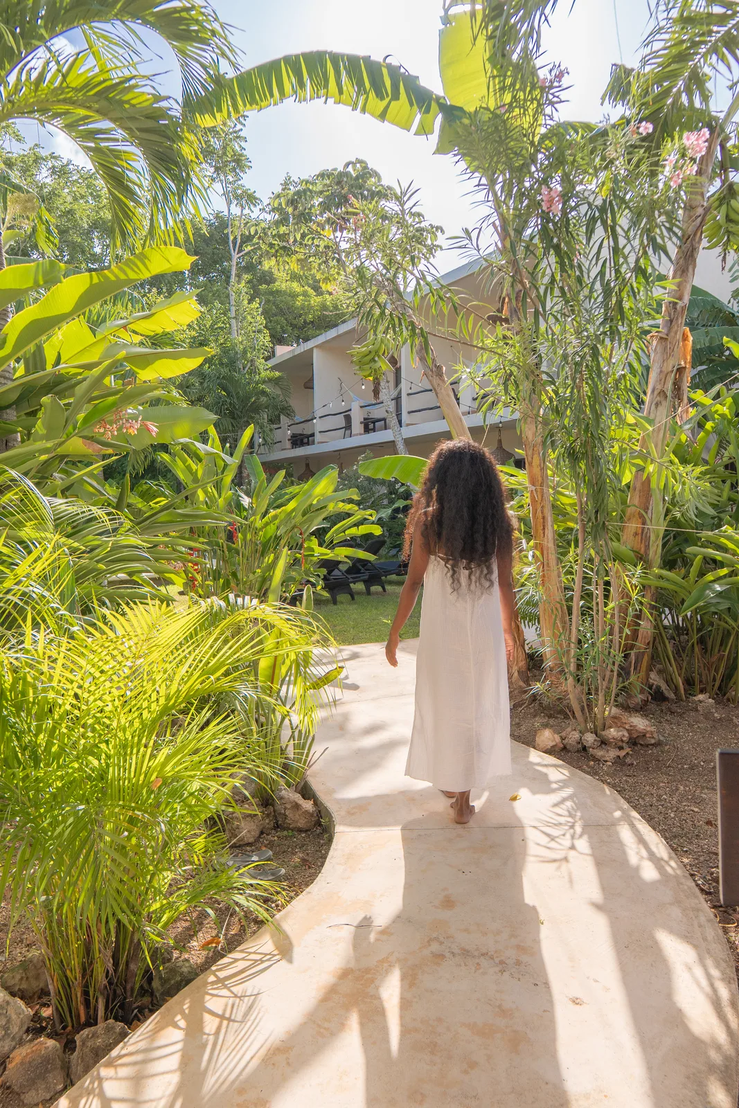
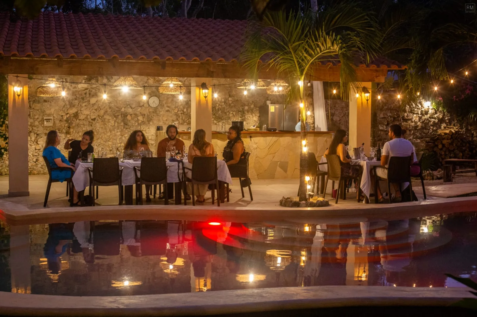
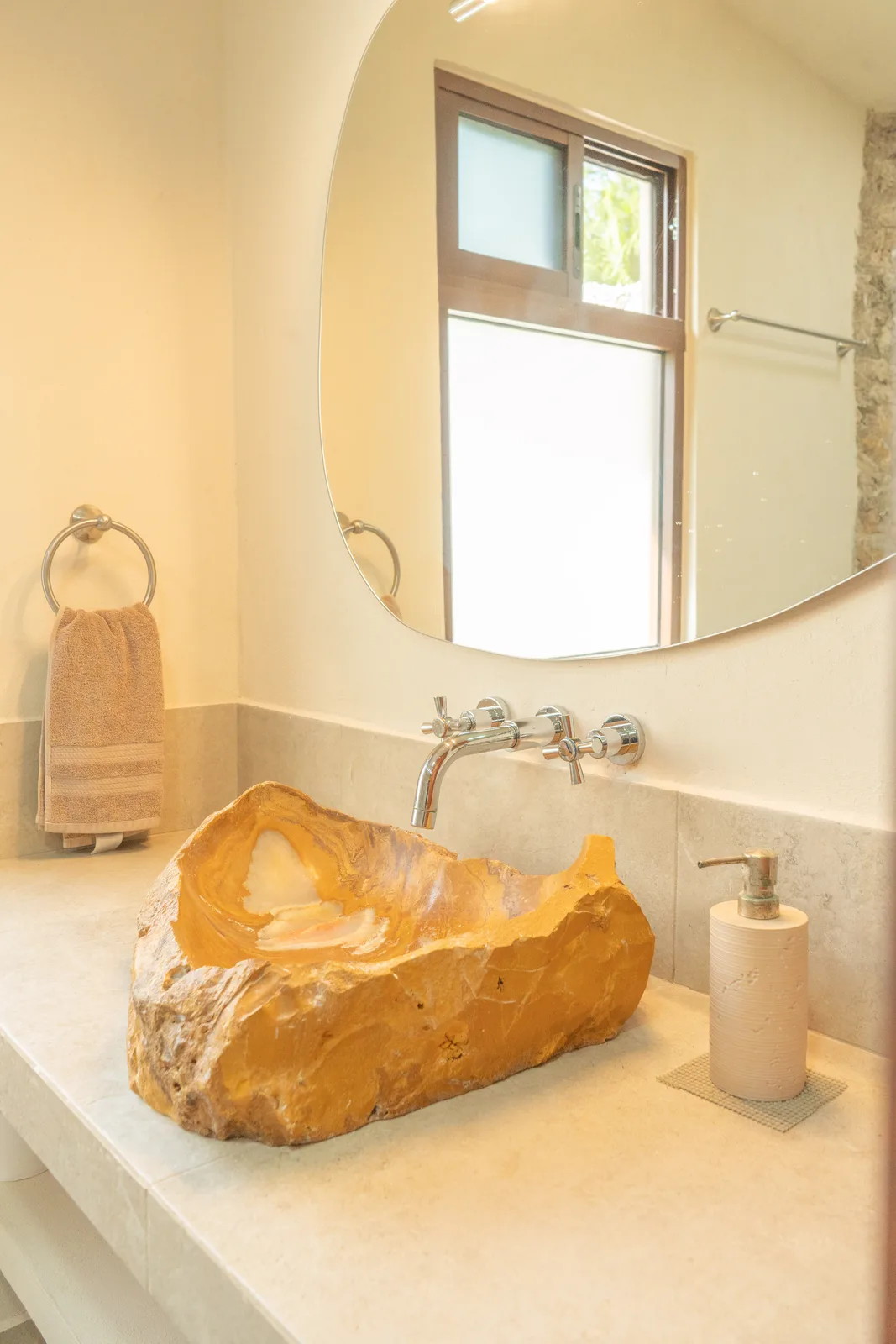
- Warm, directional natural light
- Calm composition with breathing room
- Texture — stone, water, foliage, cane
- Candid people, not posed models
- Heavy filters or unnatural saturation
- Clutter with no focal point
- Hard midday shadows
- Anything that feels like a stock catalogue
Image naming & assets
Every photo follows one flat, descriptive convention so the library stays searchable and the gallery can build itself. Lowercase, hyphen-separated, one subject per name, real names for people, a view suffix when it helps. Served as .webp from /images/.
aerial-pool-freeform-spa-steps-couple-overheadzone + subject + viewbungalow-bedroom-stone-wall-pendant-lights-bench-frontalroom, materials, anglegarden-cactus-top-down-gravel-detaildetail / texture shotmari-portrait-sun-lounger-book-lime-drink-bungalowreal name for people
DSC_1234.jpg→rename-images.sh→name.webp→build-gallery→/gallery
Drone and rotated shots get their EXIF orientation baked in before conversion (fix-orientation.py) so nothing lands sideways. The gallery list is generated from the folder at deploy — never hand-edited.